This page serves as a palette for all the components this project has to offer.
Definitions
WYSIWYG: What you see is what you get.
Component: A lego block like code element you can use for more advanced content like buttons.
MD: Shorthand for Markdown
MDX: Shorthand for MarkdownExtended (i.e. MDX is the name of the rendering engine we use.)
Child/Children: Content that is wrapped by a Component. New lines between content will be recognized as a new child.
Child Rule: A pattern introduced for more complex components that recognized each individual child as a repeatable element of a component. (i.e. List, InfoBlock, etc.)
Disclaimers
To see dark/light mode variants click the moon/sun in the header
This palette is primarily to showcase component usage in a vacuum.
For an in-depth chart on props available for these components please see the Cheatsheet
Any component that's not listed here, but exists in the project
Always remember. What you see is what you get (WYSIWYG).
Child Rule in Effect
This means that each new line in your Markdown file is treated as its own "child", which is really important in terms of what gets rendered where.
Click the Accordion header to show and hide the content it offers.
The first element is always the header. Every other element will be hidden away.
<Accordion>
Child 1
Child 2
</Accordion>
Child 1
Aligner
This is a utility component built to work with the
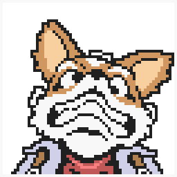
ImageThis component exists because remark-images wraps our elements automatically with styles that make it difficult to align an image. It only really works well if the container of the image is large enough to facilitate it.**
<Aligner center sx={{height: '400px', width: '100%'}}>
<Image src="/images/starfox.png" />
</Aligner>
<Aligner bottom right sx={{height: '400px', width: '100%'}}>
</Aligner>


This is a utility component originally built to display the AllContributors grid. Yet, it also serves as good way for folks to set an author at the end of a page.
<Authors all/>

<Authors list author="@MaximumCrash"/>
- 💻
It's also possible to render a custom author by filling out the correct information like so:
You MUST fill out the information EXACTLY how it's written below to get a custom author to render with the correct information.
<Authors list>
<Box>
 [Réjon
Taylor-Foster](https://rejontaylor.com) [Another
Test](https://github.com) [Twitter](https://twitter.com)
[Medium](https://medium.com) # Réjon Taylor-Foster ## Lorem ipsum dolor
sit amet, consectetur adipiscing elit. Donec pharetra quam augue. Nulla
facilisi. Ut sed volutpat nisl. Cras eget nunc sed erat malesuada
faucibus. Donec non vehicula elit. Interdum et malesuada fames ac ante
ipsum primis in faucibus. Sed blandit imperdiet maximus. In hac
habitasse platea dictumst. Sed id luctus justo. Morbi in tortor et quam
lacinia finibus ac in quam. Suspendisse mollis efficitur dui eu laoreet.
### MaximumCrash - ideas - audio - doc - 👀 - 💦
</Box>
</Authors>
It's a button. Not much more to it.
Because this site doesn't provide any stateful functionality (besides light/dark modes), Buttons are built to serve as a unique visual display of links.
<Button to="/"> ET phone Home </Button>

<Button secondary inline to="/resources/recipes/palette"> Inlined Secondary </Button>

<Button outline to="/resources/recipes/palette"> Click Here </Button>

<Button small to="/resources/recipes/palette"> Small Button </Button>

<Button to="https://rejontaylor.com"> External Link Button </Button>
Callout
This component is for callouts. It can also be written as a blockquote
>To have icons show up you have to provide an icon name from our icon palette. See the Icon Palette for those.
<Callout>

Howdy

</Callout>

<Callout icon="lightbulb">

Kernel callout

</Callout>

> blockquote Callout Markdown Style
Howdy
Kernel callout
blockquote Callout Markdown Style
Checklist
This is a non-functioning checklist component. It is simply styled to look like one.
<Checklist>
    Child A Child B
    <Box>
        Child C<Checklist>Child C - A Child C - B</Checklist>
    </Box>
</Checklist>
Child A
Child B
Child C
Child C - A
Child C - B
Chocolate (Box)
Originally named "Chocolate Box" components, this component takes into consideration the child rule. Each child is recognized as a new element. Thus it's recommended for more diverse content to be contained by a
Box
<Chocolate>
    <Box>
        <Icon size={"40px"} name='maker' />
        Child A Some content about something
    </Box>

    <Box>
        <Icon size={"40px"} name='globe' />
        Child B Some content about something
    </Box>

    <Box>
        <Icon size={"40px"} name='wrench' />
        Child C Some content about something
    </Box>
</Chocolate>
Child A
Some content about something
Child B
Some content about something
Child C
Some content about something
Code
There are 2 types of code elements.
- The code blocks you've been seeing so far that leverage 3 back ticks
(```) - Inline code that leverage 1 back tick
like this
#2 makes use of the
Code<Code>
const var = "variable";
</Code>
const var = "variable";However inline code doesn't support language highlighting.
#1 makes use of the PrismJS library in conjunction with ThemeUI to render code blocks like so.
We only support so many languages (JS, Text, HTML, CSS, and Markdown). If you want more, check out the PrismJS documentation about it.
You can provide a language to show it's tab.
const variable = "string";
If you want to show a file name just provide
title=file-name.jsconst example = "This is an example with a title tab";
Column
This component follows a similar pattern to that of the
Chocolate BoxBox
<Column>

Child A - Full Width

</Column>

<Column>

Child A - with Sibling

Child B - with Sibling

</Column>

<Column>

<Box>

#### Child A

Full Width with a Header

</Box>

</Column>


<Column>

<Box>

#### Child A

With a sibling and a Header

</Box>

<Box>

#### Child B

With a sibling and a Header

</Box>

</Column>
Child A - Full Width
Child A - with Sibling
Child B - with Sibling
Child A
Full Width with a Header
Flash Cards
These series of components (Flash) and (Card) are the (Hammer) and (Nail) equivalents that come together to establish a Flashcard game session.
To establish a session you simply place
FlashCardEach child of Flash must be a Card component, all other components will be ignored and not rendered.
Each Card component recognizes it's children, following the child rule, where the first child is the question, the second child is the answer, and any other children are treated as sub answer copy text. If you want a more complex question, or answer, it is recommended you use a Box component, and then render out your structured question to meet your needs.
Once all the Flash cards have been revealed and answered, the session is marked as complete, and you'll see the "Review completed" dialogue.
NOTE: Flashcard session state is currently tied to the Flash component itself, there is no global state storing answers at the time of this writing.
NOTE: The
Card
<Flash>

<Card>

What kinds of conversations do we build together in Kernel?

Horizontal

</Card>

<Card>

Who's the coolest?

You're the coolest

</Card>

<Card>

For whom does the Taco Bell toll?

Us All

</Card>

</Flash>
What kinds of conversations do we build together in Kernel?
Horizontal
Info Block
This component is similar to that of a Hero image content section. Depending on when you put the image is the side it will show up on. If there's no image first or last in content, the content will be centered.
It is highly recommend you use a box component here. Each child is recognized and will render as so.
<InfoBlock>

<Box>
### Hello World
Some more content
</Box>
</InfoBlock>
<InfoBlock>
<Box>
### Hello World
Some more content
</Box>
<Image src="/images/starfox.png" />
</InfoBlock>
<InfoBlock>
<Box>
### I am centered
<Image src="/images/starfox.png" />
Some more content
</Box>
</InfoBlock>

Hello World
Some more content
Hello World
Some more content

List
To get the most out of lists (i.e. headers, subcontent, links) you MUST use a
BoxLink
<List>

Element A

Element B

</List>

<List>

<Box>

Element A Header

Some content below the header

</Box>

Element B with no subcontent

<Box>

Element C Header

Some content below the header

</Box>

</List>

<List>

<Link to="/">

Link Element A Header

Some content below the header

</Link>

<Link to="https://makerdao.com/">

External Link Element B Header

Some content below the header

</Link>

</List>
Element A
Element B
Element A Header
Some content below the header
Element B with no subcontent
Element C Header
Some content below the header
Link Element A Header
Some content below the header
External Link Element B Header
Some content below the header
Process
This components great for stepping folks through a numbered process.
<Process>
    ### Process Information 1 ### Process Information 2
    <Box>
        ### Process Information 3 Some more content here. The usual suspects and
        whatever you'd want to put.
    </Box>
</Process>
Process Information 1
Process Information 2
Process Information 3
Some more content here. The usual suspects and whatever you'd want to put.
Status Banner
This is your run of the mill status banner. It's also capable of being sticky.
<StatusBanner>

Regular old status banner

</StatusBanner>

<StatusBanner warning>

Warning status!

</StatusBanner>

<StatusBanner sticky>

I will stick to the top of the screen.

</StatusBanner>
Regular old status banner
Warning status!
I will stick to the top of the screen.
Tables
We support the lowest spec for tables in MD. None of that Github alignment stuff here.
| Header A       | Header B                    |
| --------------- | ------------------------- |
| Content A        | Content A              |
| Content B          | Content B              |
| Header A | Header B |
|---|---|
| Content A | Content A |
| Content B | Content B |
Tout
Tout components are meant to be like ultra fancy links, but you can put anything inside of them. If there's only one child it will be full width.
<Tout>

Element A - Full Width

</Tout>


<Tout>

### Element A

### Element B

</Tout>
Element A - Full Width
Video
It's possible to show videos here. They'll always be full width with no styles.
`youtube: [Your love!](mzDVaKRApcg)`

<Video src="https://www.youtube-nocookie.com/embed/kpk2tdsPh0A"/>
Text
Header 1¶Header 2¶Header 3
Header 4
Large Text
Bold text
Regular text
Small text Micro text CapsLinkThis is a living document. Add or remove components as you change things. And always remember to have fun.
 Vivek Singh
 thetagan
 davidhuntmateo
 Philip Sheldrake
 Jess Sun
 Aliya
Aliya sidcode
 MacEagon Voyce